KC Pellets was in need of rebranding their logo. I was tasked with creating something simple and modern. I utilized a modern typeface with a simple flame icon.
When designing the logo, I was brainstorming different ideas on how to make this mark special. I played with pellet ideas but shifted my focus on the flame.
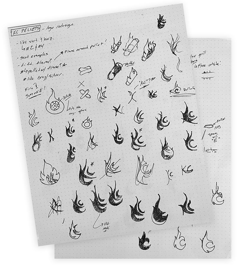
Sketches

Flame Variations
Early in the mockup phases, I tried creating a flame that had a "KC" sublimely within. We were close to getting that to work but decided on the spatula within the negative space. I personally wanted to stay away from that idea, as it has been done before, but that is what the client requested. I was grateful that I was given time in the creative process to explore that theme.
Final Logo Design:


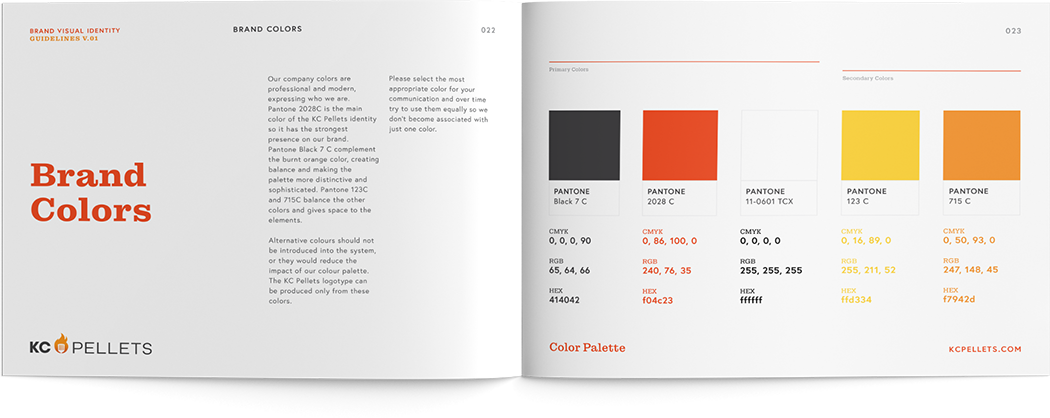
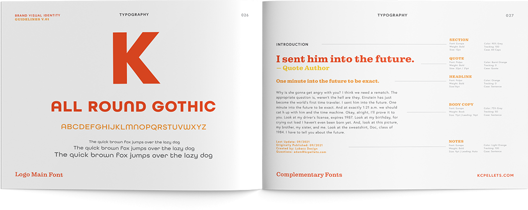
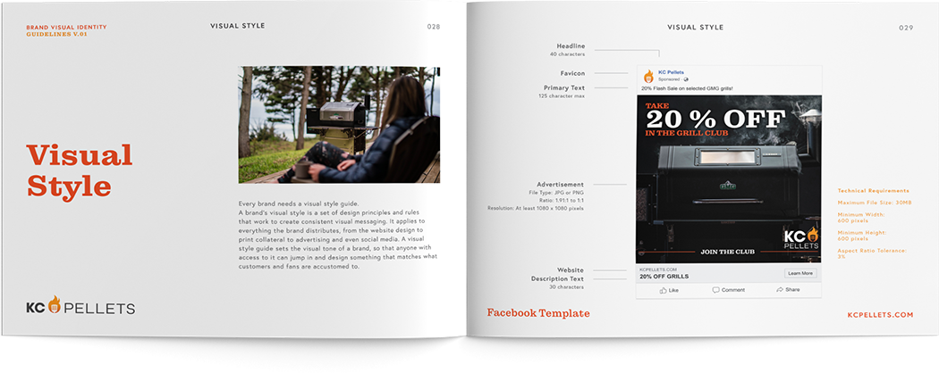
Brand Guidelines:
(sample pages)
Cover
After the logo was set in place, we shifted gears to talk about KC Pellet's social media ads. The client wanted to know how to ensure that one ad on Facebook will look the same as say a Google AdWords ad. I advised the client that a brand guideline is a great tool that will set in place their tone, message, and overall visual look and feel of their brand to keep their messages consistent.
Interior Pages: